
I tested 12 different paint colors for our hallway over the past 4 months. Nothing seemed quite right.
The hallway is long—about 70 feet from the front door to back bedroom. Every room in the apartment is off this hallway, so it has to be complementary to the other rooms. We didn’t want the hallway to be boring either. I took my time with the decision.
Adding to the conundrum is the textured, floral wall covering that decks the halls from wainscot to baseboard. Grandma has arrived, and she is floral and textured and in my hall! Any paint with the slightest tint of rose or peach or cream channels a Poconos B&B when applied on this surface.
Don’t get me wrong—I like the textured stuff. But it is a design element that needs to be properly handled.
When we demo-ed the powder room door, this textured material appeared to be pressed cardboard. A recent This Old House article proved it to be Lincrusta, a mix of linseed oil, wood paste, and other natural products. Covered with ~10 layers of paint. In Victorian times they would also make this product out of tin or pressed leather.
 |
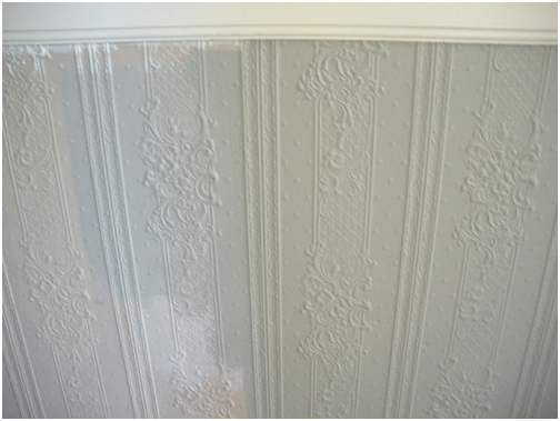
White paint samples on the wall and textured flowers. |
First I tested a bunch of neutral whites (Benjamin Moore’s China White, Powder Sand, Linen White, and Ivory White). All were too drab in our narrow & dark hallway. It was astonishing how whites could be so different, though. Side by side you saw that some had startling yellow undertones, other whites were pink, others were grayish or bluish or brown.
 |
Benjamin Moore Colors: China White, Linen and Powder Sand respectively. |
I went back to my favorite blog, Apartment Therapy. I read that if you have a small space and you paint it white, then you have a small white room. If you paint a small space a more unexpected color, however, then you have something different on your hands. I also watched an online tour of Farrow & Ball Color Consultant Joa Studholme’s home. Inspiration!
Next I tried some deep brownish-greens that the color consultant at G&R Paint recommended. They were nice, but the look was too camouflage for me. The flowers had a military moment.
 |
Farrow & Ball Colors: Down Pipe, Lamp Room Gray, Green Smoke and Fawn respectively. |
Finally I went to San Francisco’s only Farrow & Ball dealer, Fregosi Paint in SoMa. There we took home samples of four paints (Down Pipe, Green Smoke, Fawn, and Lamp Room Gray). The color consultant at Fregosi advised us on the choices and gave us some sound advice: In a room that is divided by a wainscot or trim, paint the upper field the darker color. It will make your artwork pop. Dark colors also visually recede, making the room feel bigger at eye-level. Farrow & Ball paint is not cheap ($85/gallon, and you need multiple coats) but it is clay-based and touted for its rich color and high-quality finish.
We went home and tested the colors. Together, Dean and I picked the boldest combination: Down Pipe—a dark charcoal—and Lamp Room Gray— a light gray for the textured flowers on the bottom. The grays are really modern so Granny will not take up permanent residence in the hall. And they match the off-white trim we have been using throughout the house: C2 Paint’s Halo.
Painting a room Down Pipe is a plunge—it is essentially one shade lighter than black. I went online and searched for Down Pipe, hoping to see some images of rooms painted that color. I came across these images at the Metropolitan Museum of Art’s J.M. Turner exhibition. I was sold.
The adventure did not end here, sadly. I went back to Fregosi and ordered 2 gallons of paint. Unfortunately, they did not have those Farrow & Ball colors in stock, and we had to wait 5 days to receive them. Drat. I started thinking about our upcoming weekends (A weekend in Tahoe, followed by two weekends in Mexico, followed by a weekend visit from Dean’s parents from Michigan, followed by another weekend in Tahoe).
We have some major schedule issues, of our own creation. I needed that paint now, so I could use it that weekend—my last free weekend in over a month.
This was a mistake. Listen here: Never rush renovations! Renovations always take 3x longer than you think.
The paint guy at Fregosi offered to “match” the Farrow & Ball colors, using Benjamin Moore Aura paint ($65/gallon). I used Ben Moore Aura in the living room and really loved how easily it went on, and have enjoyed its finish and depth ever since. So I agreed to this solution.
 |
The Gray on the left is the Farrow & Ball sample, and the field on the right is the "matched" paint that I bought. The tan background is the hall's original color. |
Alas, I brought the paint home and realized that the paint did not look anything like the F&B sample that we tested and chose. Three shades darker and way muddier. Drat again! A weekend lost.
I went over to Fregosi at lunchtime to return the paint and extend some constructive criticism on their color matching. Much to my surprise, the paint that they mixed for me matched the color card, which matched their sample pot. So why does the sample on my wall not match these other identical paints? Did I get the wrong sample pot? Was my sample pot defective? Are those flowers plotting against me? Who wants to deal with this anyway.
I will wind up a long story now: My sample pot was Lamp Room Gray, but the differences between the textures of the two paints caused a huge color difference when on the wall. With the Farrow & Ball, the white primer shined through two coats of paint. So the effect was much lighter than the thick Benjamin Moore stuff. On their website, Farrow and Ball recommends a specific “undercoat” to this paint, which may have made it match the color card more precisely.
Lesson learned: If I want the color to precisely match the sample pot, buy the same brand. “Matching” colors is a inexact science.
The hallway looks good—we are happy with the end result.
 |
Where the hallway bends toward the back of the apartment. One reason the dark gray works so well is that the ceiling is still white and there is lots of white trim. |
 |
The flowers are a little more modern in Lamp Room Gray. |
 |
The front hall. |
 |
The view to the front hall from the living room. |
 |
Dark colors make your artwork "pop." |
-Andi