Tuesday, May 3, 2011

Tick Up the Bathroom Count to... 1.5!

9 comments
This blog is about the design and finishes of our new ½ bath. Later Dean will regale you with construction stories.

Our new half bath! (Thanks to my sister Val for these towels--a gift!)
The big news: we are done with the inside of the bathroom! It took a long time to turn a closet into a ½ bath and was not heaps of fun at different points in the project. We worked on it for 8 weekends in January, February and March, and on every one of those Saturdays I would wake up and think, “I wish I could go on a hike/to brunch/to yoga today.” But it is finished and we think it is the most beautiful ½ bath on the planet. Sometimes I open the bathroom door and just stand there and admire it, like a prize pony or precious gem.  This is definitely a result of building the bathroom with our own four hands. Very satisfying.

The closet before we turned it into a
bathroom. Yes, this is the same space!
The Villeroy & Boch sink.
The ½ bath is a mix of high and low. We were on a budget and so we had to pick our splurges judiciously.

The “Highs”:

The Sink: We found this white porcelain Villeroy & Boch sink online for $510.30 (on sale, regularly it is around $760). In case you ever want a similar sink, I think our Google search term was “very small sink.” It had to be no more than 15 inches deep to preserve the 24 inches of clearance to the toilet that San Francisco building code requires.

It was a leap of faith to order the most expensive bathroom element sight-unseen (at $510.30, the sink was over 30% of our budget for fixtures and finishes). But honestly there were not many choices on the teeny-tiny sink market and this one is unusual, well-proportioned and modern all at the same time. It reminds me of a bubble, a lily pad or Camilla Parker’s hat at the Royal Wedding. We get lots of compliments on it. We added a contemporary exposed plumbing below the sink for $75 in parts.

Shopping Tip: I always did Google Image searches when shopping for bathroom finishes. It is much easier to scan pages of images rather than click through hundreds of links to see the actual sink, faucet, tile etc. I imagine this technique would be good for shopping for many different items.

Farrow & Ball colors: Borrowed Light and Oval
Room Blue for the ceiling.
The paint: We splurged on Farrow & Ball’s Borrowed Light for the walls and Oval Room Blue for the ceiling. They are absolutely beautiful. In House Beautiful one designer said, “Borrowed Light feels as if you've taken the roof off the room and the sky and the clouds have mixed together.” After my fiasco in the hallway trying to match Farrow & Ball paint, I went straight for the brand name in the bathroom. We are super happy with the result. Cost: $100 for a small room.

The “Middles”:

The "Santa Rosa"

The faucet:  We bought this Danze faucet for $159. We needed a single handle faucet and liked the lines on this one. It is a good compliment to the circular sink and floor tiles, and provides good contrast with the boxy mirror and light fixture. Faucets can be really expensive ($500+ at Waterworks) and really cheap ($30 at Home Depot). We thought this was a good compromise.

Ann Sacks Savoy Cottonwood penny tile.

The toilet:  We picked the Kohler “Santa Rosa” and paid $293 at Home Depot. I don’t think too much about toilet design. I didn’t even know toilets had names like the Santa Rosa. To me, it is utilitarian. We choose Kohler’s Santa Rosa because it is on the modern side of things and it meets San Francisco’s strict environmental requirements for low water flow.  It also accommodated the clearance space we needed between the toilet and sink.

The tile: For the floor we picked a penny tile from Ann Sacks at $10.98 a square foot. It is called the Savoy Cottonwood penny tile. You can certainly get cheaper penny tile, but this tile has a ring of faded blue and brown on the outer edges, which is an important design element in the room. Total tile price was $179.48.

We love that the tile is a traditional shape for an old Victorian home but the faded border brings a pop of modernity. Also, we decided not to tile the walls—a cost-savings measure and it seemed unnecessary in such a small room with no possibility of steam. Dean laid the tile himself and he will tell you more about that adventure. His takeaway was that anyone can lay tile and achieve a B+ product! Good enough for us.

The “Lows”:

The mirror: It is from Ikea and was hanging in the bedroom in our old apartment. The wood frame brings nature into the room, which is important. Without the touch of natural wood the room could feel more like a pharmacy and less like a spa. Cost: Nothing because we already owned it.

The mirror and Dean's work of nature art.

The vintage door, salvaged from another
Victorian.
The door: This is a long story, but the Victorian four-panel door that was originally on the closet could not be reused when we moved the door to the adjacent wall. It had to do with the stud spacing and the giganticness of that door. So we took that door to the architectural salvage yard (Building Resources) and picked a smaller used door, also Victorian and four-paneled. Total cost: $75.

The light fixture: It is from Lamps Plus and cost $92.44. Nobody is going to write home about this light. I had a hard time picking a light fixture and decided that I would buy this as a placeholder. I might upgrade the light in the future if I decide this one is too boring. Switching a light fixture is simple, unlike ripping out tile, a sink, or a toilet.  For now I think it is fine—not the highlight of the room, but it also does not compete with the design elements that are more important to me.

The light fixture and ceiling design.
The hardware: I love the towel bar, toilet paper holder, and little glass shelf we bought at Home Depot. They are from the Innova Jameson line, and seriously look as nice as products from Restoration Hardware that cost 3X as much. Total Cost: $80.00.
The ceiling fan: I qualify this as more of a mechanical element than a décor feature. There is a plastic cover on the ceiling that hides the fan, so it is visual in some way. A fan is required for every bathroom per building code. We chose this charcoal ductless fan—the used-Hyundai of fans (Nutone 682NT).  It is fine, necessary, whatever. Dean bought it on Amazon.com for $32.57 because I am not that interested in it.

The Trim: Dean bought the trim and crown molding at Home Depot. It is a good size for the room and covers the craggy corners. Cost: $60.

The staging: I put a candle in a cool saucer that was my Grandmother’s. Cost: Free.
Dean picked up some rocks on Baker Beach and stacked them himself to create a rock sculpture. Again, bringing nature into the bath is soothing and exudes a spa feeling. Cost: Free.

I stacked some toilet paper on the shelf. Cost: Not pertinent because it is functional.

I hung a watercolor that I painted of Dean on a hiking trip to Tamarac Lake in the Desolation Wilderness. Cost: Free because I already had the frame.

And there you have it! All of our bathroom fixtures and finishes. Total cost: $1,656.89. It is astonishing how many design choices you have to make for a room that is 15 square feet.  


Architectural detail in the spot where the former
door was placed.

The 1/2 bath!


We love our new bathroom and it has already brought more harmony to our home. Dean and I no longer get in arguments when one person spends way too much time in the bathroom. And now we can renovate our main bathroom in August without running to Popeye’s every time we need the loo!  

Staging and our cute new shelf ($39.99).

Clearance between sink and toilet: very important to San
Francisco building department.


Sunday, March 6, 2011

Picking Paint Colors for a Challenging Space

6 comments
I tested 12 different paint colors for our hallway over the past 4 months. Nothing seemed quite right.

The hallway is long—about 70 feet from the front door to back bedroom.  Every room in the apartment is off this hallway, so it has to be complementary to the other rooms. We didn’t want the hallway to be boring either. I took my time with the decision.

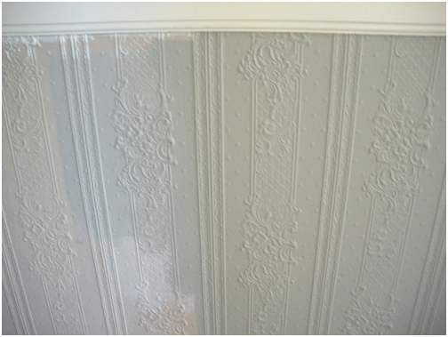
Adding to the conundrum is the textured, floral wall covering that decks the halls from wainscot to baseboard. Grandma has arrived, and she is floral and textured and in my hall! Any paint with the slightest tint of rose or peach or cream channels a Poconos B&B when applied on this surface.  

Don’t get me wrong—I like the textured stuff. But it is a design element that needs to be properly handled.

When we demo-ed the powder room door, this textured material appeared to be pressed cardboard. A recent This Old House article proved it to be Lincrusta, a mix of linseed oil, wood paste, and other natural products. Covered with ~10 layers of paint. In Victorian times they would also make this product out of tin or pressed leather.

White paint samples on the wall and textured flowers.
First I tested a bunch of neutral whites (Benjamin Moore’s China White, Powder Sand, Linen White, and Ivory White). All were too drab in our narrow & dark hallway. It was astonishing how whites could be so different, though. Side by side you saw that some had startling yellow undertones, other whites were pink, others were grayish or bluish or brown.

Benjamin Moore Colors: China White, Linen and Powder Sand respectively.
I went back to my favorite blog, Apartment Therapy. I read that if you have a small space and you paint it white, then you have a small white room. If you paint a small space a more unexpected color, however, then you have something different on your hands. I also watched an online tour of Farrow & Ball Color Consultant Joa Studholme’s home. Inspiration!

Next I tried some deep brownish-greens that the color consultant at G&R Paint recommended. They were nice, but the look was too camouflage for me. The flowers had a military moment.

Farrow & Ball Colors: Down Pipe, Lamp Room Gray, Green Smoke and Fawn respectively.
Finally I went to San Francisco’s only Farrow & Ball dealer, Fregosi Paint in SoMa. There we took home samples of four paints (Down Pipe, Green Smoke, Fawn, and Lamp Room Gray). The color consultant at Fregosi advised us on the choices and gave us some sound advice: In a room that is divided by a wainscot or trim, paint the upper field the darker color. It will make your artwork pop. Dark colors also visually recede, making the room feel bigger at eye-level.  Farrow & Ball paint is not cheap ($85/gallon, and you need multiple coats) but it is clay-based and touted for its rich color and high-quality finish.

We went home and tested the colors. Together, Dean and I picked the boldest combination: Down Pipe—a dark charcoal—and Lamp Room Gray— a light gray for the textured flowers on the bottom. The grays are really modern so Granny will not take up permanent residence in the hall. And they match the off-white trim we have been using throughout the house: C2 Paint’s Halo.
Painting a room Down Pipe is a plunge—it is essentially one shade lighter than black. I went online and searched for Down Pipe, hoping to see some images of rooms painted that color. I came across these images at the Metropolitan Museum of Art’s J.M. Turner exhibition. I was sold.

The adventure did not end here, sadly. I went back to Fregosi and ordered 2 gallons of paint. Unfortunately, they did not have those Farrow & Ball colors in stock, and we had to wait 5 days to receive them. Drat. I started thinking about our upcoming weekends (A weekend in Tahoe, followed by two weekends in Mexico, followed by a weekend visit from Dean’s parents from Michigan, followed by another weekend in Tahoe).

We have some major schedule issues, of our own creation. I needed that paint now, so I could use it that weekend—my last free weekend in over a month.

This was a mistake. Listen here: Never rush renovations! Renovations always take 3x longer than you think.

The paint guy at Fregosi offered to “match” the Farrow & Ball colors, using Benjamin Moore Aura paint ($65/gallon). I used Ben Moore Aura in the living room and really loved how easily it went on, and have enjoyed its finish and depth ever since. So I agreed to this solution.

The Gray on the left is the Farrow & Ball sample, and the field on the right is the "matched" paint that
I bought. The tan background is the hall's original color.
Alas, I brought the paint home and realized that the paint did not look anything like the F&B sample that we tested and chose. Three shades darker and way muddier. Drat again! A weekend lost.

I went over to Fregosi at lunchtime to return the paint and extend some constructive criticism on their color matching. Much to my surprise, the paint that they mixed for me matched the color card, which matched their sample pot. So why does the sample on my wall not match these other identical paints? Did I get the wrong sample pot? Was my sample pot defective? Are those flowers plotting against me? Who wants to deal with this anyway.

I will wind up a long story now: My sample pot was Lamp Room Gray, but the differences between the textures of the two paints caused a huge color difference when on the wall. With the Farrow & Ball, the white primer shined through two coats of paint. So the effect was much lighter than the thick Benjamin Moore stuff.  On their website, Farrow and Ball recommends a specific “undercoat” to this paint, which may have made it match the color card more precisely.  

Lesson learned: If I want the color to precisely match the sample pot, buy the same brand. “Matching” colors is a inexact science.

The hallway looks good—we are happy with the end result.

Where the hallway bends toward the back of the apartment. One reason the dark gray works so well is
that the ceiling is still white and there is lots of white trim.
The flowers are a little more modern in Lamp Room Gray.
The front hall.
The view to the front hall from the living room.
Dark colors make your artwork "pop."
-Andi

Wednesday, February 2, 2011

Potential Paint Tips

1 comments
Andi and I have now painted about half of our apartment. We've used a spray gun, rollers, brushes, little detailed paintbrushes, fingers, etc. to paint different portions of the unit. As a result, we've learned a thing or two that may or may not help someone who is about to paint their own apartment and who may or may not be looking for tips. I am going to err on the side of too much information is a good thing and do my part to overload the information super-highway. Here are 10 painting tips that may or may not be useful. Or even applicable to painting.

Tip #1: Spray guns are finicky. Theoretically they paint a surface smoothly and quickly. Practically, they paint a surface. And not always smoothly and quickly. Most commonly, the paint is too thick and clogs the spray nozzle—especially primer. Primer usually contains filling and binding agents that make spraying through fine spray nozzles very difficult. I was told that you could “thin” paint and/or primer with water, but I also read water reduces the effectiveness of the paint and/or primer. What to do?!?! So I loaded the gun sans thinner and hoped for the best. That meant I stopped and cleaned the gun about every 50sf of wall area or so. Or about 5 minutes of solid spray time before the gun started spitting like a llama.

Tip #2: Spray guns cover a lot of stuff. Pipes, conduit, ducts, sheet metal, mouse traps, redwood siding, cloth and windows are no match for a spray gun. If the target surface is properly prepared, the spray gun will give you the best, and quickest, paint cover over odd obstructions. Painting nooks and crannies with a brush is labor intensive, and pretty much just sucks.

The painted pipes, duct, sheet metal and redwood siding.
Tip #3: Latex paint does NOT bind to oil-based paint very well. When we prepped the trim for new paint, the existing uppermost layer of latex paint pealed away in large swaths of failure and disappointment since it was applied directly to a layer of oil-based paint. To avoid this feeling of paint rejection you need to remove the top layer of latex paint with a scraper or your finger nails, sand the jagged edges or corners and areas where the latex was too stupidly stubborn to peel off, and prime. That is the only way you’ll get the final coat of latex paint to bind to the existing surface adequately. And look decent. Painting over areas where the original paint has peeled looks like you painted over areas where the original paint has peeled.

Tip #4: Oil-based paint works best on trim since it goes on in one coat and self-levels itself, removing any indication of brush strokes. We did not learn this from experience—I saw it on a 30-second infomercial on HGTV. That tip would have really come in handy when we painted our trim.

Tip #5: When using a roller, first brush the paint out 6” from any trim, corners, and areas where the color changes. This allows you roll away with little repercussions, kind of like high-roller on a hot craps table. In addition, a brush stroke looks a lot different than a rolled stroke. I prefer the aesthetic of a rolled stroke so rolling after brushing blends the two techniques better.

Tip #6: When painting with a brush, apply the paint in long horizontal or vertical strokes. Follow these directions:

1.     Apply copious amounts of paint to the brush but not too much that you’re dripping all over your hand, the floor, or anything else that you want to avoid getting paint on (maybe your Harry Potter book collection?).
2.     Apply the paint evenly in one direction (maybe a 3’ length).
3.     Flip the brush over and apply the paint over the same area in the opposite direction, starting just past where you ended your first stroke and extending just past the spot where your first stroke started.
4.     Repeat steps 2 & 3 about 1-2 more times until you need more paint on the brush.
5.     GOTO 1 (and move down, up or over on the wall).

Do not start a stroke in the middle of a wet area. Latex paint starts drying pretty quickly. You will just remove some of the paint from the area and will have to touch it up later.


And don’t forget to breath, Daniel-san.

Tip #7: This may be obvious to most but was somewhat of a surprise to us: rolling uses a helluva lot more material than brushing.

Tip #8: Paintbrushes and roller covers have a shelf life. They are not immortal, like the great Gary Busey, especially if cared for poorly. So take care of them! Wash thoroughly.

Tip #9: Everything always looks better after a second coat.

Tip #10: Blue painter’s tape does little to stop the paint from creeping under the tape. Touch up at edges is always necessary. If someone has a tip on how to seal the tape to an edge better, we’re all ears.

Dean

Tuesday, January 25, 2011

Show You The Door

1 comments
The grossest area of our apartment was the laundry room. We took care of that. This brings me to the second grossest thing in our apartment: the front door. These are defining features:

The front door with the dirty curtain.
·          Dirty smudges everywhere that we cannot wipe off
·          A jagged mail slot (cut with a hatchet?). Also dirty.
·          A dingy curtain, dabbled with what appears to be soy sauce and also exhaust from the street
·          Numerous broken locks hanging on it

Key descriptive terms are “dirty” and “unsettling.” In the threshold where we welcome guests and pass through after long days out in the world! It will not do.


The jagged mailslot and dirty door,
after I started painting it in C2
Paint's Nightspot.

We took the door off the hinges (well, Dean did it. The door is about 9 feet tall and weighs a hundred pounds).  I taped off the window, removed the hardware, and painted it in high gloss deep blue (C2 Paint in Nightspot). It is very elegant and unexpected.

I went online to find a metal plate to frame the jagged mail slot. We did not want to cut a bigger slot, nor did we want our Sunset magazines and frequent flier statements to get caught on a plate that was too small. It was very difficult to find in 8.25” x 1.25”, and the few I found were $75+. I prefer to spend that amount of money on sushi and haircuts.

So I went back to my fav spot: the salvage yard. There, in a giant box of mail slot plates, I found the right size for $1.50. It needed a coat of paint because the metal was not shiny, nor did it look like it ever would be again. But that was fine by me. I painted and installed it and it looks sleek.

The final step was curtains. Dean and I prefer window coverings to be inconspicuous, allowing the architecture to shine.  However, all of our neighbors have white curtains on their front doors, and we wanted our door to be visually congruous from the outside.

A finished door with faux frosted
glass.

After: Mail slot with painted frame.
We picked a product at Home Depot called Light Effects Textured Window Film. It is a plastic film that gives the illusion of frosted glass, but you can remove it at any time because there are no adhesives used to affix it to the window. There are many similar products that are permanent, but we wanted a low level of commitment. Because, again, we were not sure how it would jive with the neighbors’ doors until tested.

We applied this product by cutting a piece to the exact size of the window with a straight edge and razor blade. Next we sprayed soapy water on the window. Then we put the custom-cut plastic film on, and smoothed out bubbles with the edge of a credit card (or a putty knife, if you want to be professional about it). It looks pretty good!


Question: Do you think it is visually cohesive with our neighbors’ doors? There is some debate in the building, but everyone seems ok with it.


The door from the outside, on the left. What do you think of the frosted glass?

The unrenovated hinges :(

The final step in the door renovation will be to do something about the hinges. They are painted over and, while still functional, need to be freshened up.

Throughout the house I have removed hinges from built-in cabinets. I boil the hinges in water with baking soda. Layers and layers of old paint easily comes off in globs, much like the consistency of dead vampires on True Blood. Then it is a cinch to polish up the hinges with Brasso, and re-attach them to the cabinet, fresh and shiny.


Dean is a little concerned about removing the hinges from the front door. If we do not re-attach them with precision, the door will not open and close well. We noticed this problem on one of our china cabinet cupboards after I boiled and re-attached the hinges, but it is not a critical because we rarely open that cabinet.


Has anyone ever re-hung a heavy door after removing the hinges? Any tips? Or should we just paint over the hinges and call it a day?

Andi

Monday, January 17, 2011

Powder Room Progress

2 comments
I have been ignoring my loyal readers of Project: Nest. I blame the holidays and writer's block (read: laziness). The new, and more frequent, blog posting begins today!

Soon after after Andi's last blog post, we found out that our plumbers were stuck at another job site and postponed the work on our project until after the holidays. I hoped to have fixtures installed before our guests arrived for our Christmas shindig (you know, to show off a little bit). Oh well. Since the plumbing was delayed, we had to delay our electrician as well. Electricians generally prefer to do their work after the plumbing is installed because plumbers are like bulldozers and plow stuff out of the way of their pipes if needed.

Yet there was still work to be done. I demo-ed the plaster on the wall where the sink will be hung because I need to install a backing plate for the sink. (A backing plate is a dimensioned lumber member that spans from stud-to-stud that I can bolt the sink to using lag bolts.) I certainly don't want someone ripping it off the wall in the midst of a drunken escapade during one of our wild parties. Because we have SO many of them. I also installed the door frame, enclosed the powder room in gyp board, and built the bathroom soffit with the help from Project: Nest friend Chris May--our first returning character!

Chris's and my handiwork.
The powder room is ready for wandering Christmas eyes.
Christmas came and went and we had a wonderful time hosting Andi's family. Our apartment proved very capable of handling families during the holiday season and will undoubtedly host many more Christmases and Thanksgivings. And maybe a New Year's Eve party or two. And a Sweetest Day card exchange.

The hired plumbers showed up for work on January 3. After our walk-through of the project, and some exploratory drilling for pipe placement, we realized that we were not on the same page financially as the plumber. Apparently the plumber did not bid the job as we asked him to and we did not understand his quote well enough to pick up on the discrepancy. A miscommunication, really. But we had to part ways with him because his revised quote became significantly greater than the other quotes.

So we hired a different plumber: Nigel Mulgrew Plumbing. Nigel, the charasmatic Irish-born faceman of the company, and Mervyn, the smiley, efficient, Guatemalan plumber, began the work January 12 and are a fantastic team. They (meaning Mervyn and his helper Julio) have done excellent work so far. Mervyn has installed the waste and vent pipes in our unit. Additionally, our upstairs neighbors decided to expedite their own powder room, and Nigel was happy to increase the scope of the project, so Mervyn has installed their waste and vent as well.

The waste and vent pipes in our garage.

Our neighbors' waste line and our vent line in our utility room. Our vent continues up into our neighbors' unit and connects with an existing vent line in their utility room. Their waste continues down into the garage and connects with the existing sanitary sewer.
The waste and vent pipes in the powder room. The rag is stuffed in the waste pipe for the sink.
While Mervyn hung the pipes, I finished hanging the gypsum board in the exterior of the new wall, taped, mudded, and sanded the wall. Not an easy thing to do well, but Andi and I think we did ok (she helped me sand). I installed metal corner strips to protect the delicate gyp board corners and taped and mudded them in place as well.

Feast your eyes on our gyp board finishing skillz!
I also hung the new door. Earlier, Andi and I visited Building REsources (where we also donated our old door and frame) and found some brass screws, hinges and a door strike for the new door. I used a wood chisel to mortise the hinges into the door frame--almost perfectly (I was a little bit off on the bottom hinge so the mortise is a little large). Finally, Andi and I patched the plaster around the new door by installing gyp board inside the gaps between the demo-ed plaster and new door frame and mudded and taped the areas that might not get covered by the new door trim. We made a visit to SF Victoriana, a shop that specializes in Victorian trim and ornamentation, to buy trim for the door, but they don't have our trim in stock. We will have to have it custom made.

Does anyone know of a good carpenter that could make our trim?

The rescued $75 door in all of its glory.
The mortised hinge.Finally, I got the architectural permit! It was freakin' expensive. $382.14 for me to sit in their office for 2.5 hours and have 4 different people look at the plans for a grand total of 15 minutes. This is why the San Francisco Department of Building Inspections gets bad *yelp ratings.

Check out our wonderfully expensive building permit drawings. Now we only have to pay $250/inspection.
Oh yeah, we bought the toilet too.

Dean