Showing posts with label projects. Show all posts

Friday, July 15, 2011

Let there be light!

3 comments
In the 3 months "off" after finishing the powder room and office nook and before starting the main bathroom, Andi has been scouring our apartment for small "projects" for us to do. Because this is our "down-time". Luckily for her (and especially luckily for me), the chandelier in our back hallway needed some attention.

For months we have not had light in our back hallway. The old, cheap, knock-off of a Scandinavian-made chandelier gave out in our first week after moving in. Until recently, it swung from its old faux-brass chain like a pathetic, undecorated global piƱata, filled with healthy and innocent things like lima beans, broccoli, and athletic socks, gently whacked a few times to ensure its contents would NOT spill all over the ground and spare all the "unlucky" children from obesity and athlete's foot. It needed to come down.

The back hallway the day we moved in.
While I clambered up our rickety 10-foot ladder and disassembled the chandelier, Andi spent time on her hobby: dissecting the internet for home improvement products. In this case, a new ceiling light. She found one at Rejuvenation – Classic American Lighting & House Parts. Since the back hallway chandelier does not have a wall-mounted light switch—it's activated only by a pull switch with a 6-foot long chain—and hardly anyone makes a ceiling light with a pull switch anymore, we placed a custom order to have our new pendant built with one.

Our choice: the Rose City
pendant.

I'm not always confident in my construction abilities, even after all of the spectacular B- work I've completed on our house so far. I get a bit queasy when I think about playing in Benjamin Franklin's toy box, especially since I’ve been zapped with a sizeable amount of electricity once before in my life. Andi, as always, is supportive and helps me to see the brighter side of things. "You can do it," she encourages. "Besides, I don't want to pay an electrician $300 to do this work." VERY convincing.

After switching off the breaker for the hallway lights and verifying 3 times that it was actually off (once with my eyes and twice with my electrical test meter), I disconnected the existing chandelier. It was pretty easy. I was surprised.

I uncovered something interesting after disassembly: a long black pipe the jutted out of the plaster ceiling like a thick black whisker. Consequently, our HOA hired an electrician to tidy up the cables on the exterior of the house because it’s being painted and we want it to look pretty, so I showed him this pipe sticking out of our ceiling. He explained that when the apartment was switched from gas lamps to electricity, the contractor retrofitted the gas pipe to accept the new electrical lights by adding threading to the inside of the old gas pipe. “You better hope the gas line is not active,” he giggled as I chuckled nervously with him. It’s not. I checked.

While we waited for the new light to arrive, we headed to Home Depot to buy a ceiling medallion, a ceiling trim piece that served three purposes: 1) it’s a decorative element that is consistent with most of the other ceiling lighting in the apartment, 2) it covered the large hole that remained from the non-functioning hard-wired smoke detector that I removed from the chandelier base, and 3) it covered the phallic gas pipe.

About a week later, the new pendant light arrived. We unpacked it, fawned over its sleek curves and shiny trim like it was a Bugatti Veyron 16.4 Super Sport and I scurried up the ladder to commence Step 2: Assembly. I connected the wires with wire nuts (after turning off the breaker, obviously) with a little more confidence than my original fumbling of the wires during disassembly and began to screw the pendant pipe into the existing gas pipe.

Square peg, round hole. Actually small round peg with thinner thread spacing and large round hole with wider thread spacing. I needed some kind part that would reduce the size and thread from the gas pipe to the size and thread of the pendant pipe. I headed over to Victor’s Lighting to see if they had this miracle contraption. “You need a thread reducer,” the guy behind the desk at Victor’s told me. (Thread reducer. Huh. ) “I have some because this is a popular issue in old Victorian homes.” One dollar later I was on my way home.

Once I had the thread reducer, installation was easy. I installed the ceiling medallion with Liquid Nails and a few screws to keep it in place with until dry. I screwed the pipe of the pendant light into the gas pipe through the thread reducer. I connected the wires with wire nuts (again making sure the breaker was off). Finally, I flipped the breaker back on and pulled the switch.
Voila!

And I'm spent...
(Except that the pull chain was a little short and Andi had to stand on her tippy-toes to pull it. The next day she brought home a chain extension, so voila again!)

Sunday, March 6, 2011

Picking Paint Colors for a Challenging Space

6 comments
I tested 12 different paint colors for our hallway over the past 4 months. Nothing seemed quite right.

The hallway is long—about 70 feet from the front door to back bedroom.  Every room in the apartment is off this hallway, so it has to be complementary to the other rooms. We didn’t want the hallway to be boring either. I took my time with the decision.

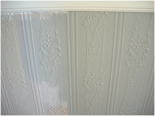
Adding to the conundrum is the textured, floral wall covering that decks the halls from wainscot to baseboard. Grandma has arrived, and she is floral and textured and in my hall! Any paint with the slightest tint of rose or peach or cream channels a Poconos B&B when applied on this surface.  

Don’t get me wrong—I like the textured stuff. But it is a design element that needs to be properly handled.

When we demo-ed the powder room door, this textured material appeared to be pressed cardboard. A recent This Old House article proved it to be Lincrusta, a mix of linseed oil, wood paste, and other natural products. Covered with ~10 layers of paint. In Victorian times they would also make this product out of tin or pressed leather.

White paint samples on the wall and textured flowers.
First I tested a bunch of neutral whites (Benjamin Moore’s China White, Powder Sand, Linen White, and Ivory White). All were too drab in our narrow & dark hallway. It was astonishing how whites could be so different, though. Side by side you saw that some had startling yellow undertones, other whites were pink, others were grayish or bluish or brown.

Benjamin Moore Colors: China White, Linen and Powder Sand respectively.
I went back to my favorite blog, Apartment Therapy. I read that if you have a small space and you paint it white, then you have a small white room. If you paint a small space a more unexpected color, however, then you have something different on your hands. I also watched an online tour of Farrow & Ball Color Consultant Joa Studholme’s home. Inspiration!

Next I tried some deep brownish-greens that the color consultant at G&R Paint recommended. They were nice, but the look was too camouflage for me. The flowers had a military moment.

Farrow & Ball Colors: Down Pipe, Lamp Room Gray, Green Smoke and Fawn respectively.
Finally I went to San Francisco’s only Farrow & Ball dealer, Fregosi Paint in SoMa. There we took home samples of four paints (Down Pipe, Green Smoke, Fawn, and Lamp Room Gray). The color consultant at Fregosi advised us on the choices and gave us some sound advice: In a room that is divided by a wainscot or trim, paint the upper field the darker color. It will make your artwork pop. Dark colors also visually recede, making the room feel bigger at eye-level.  Farrow & Ball paint is not cheap ($85/gallon, and you need multiple coats) but it is clay-based and touted for its rich color and high-quality finish.

We went home and tested the colors. Together, Dean and I picked the boldest combination: Down Pipe—a dark charcoal—and Lamp Room Gray— a light gray for the textured flowers on the bottom. The grays are really modern so Granny will not take up permanent residence in the hall. And they match the off-white trim we have been using throughout the house: C2 Paint’s Halo.
Painting a room Down Pipe is a plunge—it is essentially one shade lighter than black. I went online and searched for Down Pipe, hoping to see some images of rooms painted that color. I came across these images at the Metropolitan Museum of Art’s J.M. Turner exhibition. I was sold.

The adventure did not end here, sadly. I went back to Fregosi and ordered 2 gallons of paint. Unfortunately, they did not have those Farrow & Ball colors in stock, and we had to wait 5 days to receive them. Drat. I started thinking about our upcoming weekends (A weekend in Tahoe, followed by two weekends in Mexico, followed by a weekend visit from Dean’s parents from Michigan, followed by another weekend in Tahoe).

We have some major schedule issues, of our own creation. I needed that paint now, so I could use it that weekend—my last free weekend in over a month.

This was a mistake. Listen here: Never rush renovations! Renovations always take 3x longer than you think.

The paint guy at Fregosi offered to “match” the Farrow & Ball colors, using Benjamin Moore Aura paint ($65/gallon). I used Ben Moore Aura in the living room and really loved how easily it went on, and have enjoyed its finish and depth ever since. So I agreed to this solution.

The Gray on the left is the Farrow & Ball sample, and the field on the right is the "matched" paint that
I bought. The tan background is the hall's original color.
Alas, I brought the paint home and realized that the paint did not look anything like the F&B sample that we tested and chose. Three shades darker and way muddier. Drat again! A weekend lost.

I went over to Fregosi at lunchtime to return the paint and extend some constructive criticism on their color matching. Much to my surprise, the paint that they mixed for me matched the color card, which matched their sample pot. So why does the sample on my wall not match these other identical paints? Did I get the wrong sample pot? Was my sample pot defective? Are those flowers plotting against me? Who wants to deal with this anyway.

I will wind up a long story now: My sample pot was Lamp Room Gray, but the differences between the textures of the two paints caused a huge color difference when on the wall. With the Farrow & Ball, the white primer shined through two coats of paint. So the effect was much lighter than the thick Benjamin Moore stuff.  On their website, Farrow and Ball recommends a specific “undercoat” to this paint, which may have made it match the color card more precisely.  

Lesson learned: If I want the color to precisely match the sample pot, buy the same brand. “Matching” colors is a inexact science.

The hallway looks good—we are happy with the end result.

Where the hallway bends toward the back of the apartment. One reason the dark gray works so well is
that the ceiling is still white and there is lots of white trim.
The flowers are a little more modern in Lamp Room Gray.
The front hall.
The view to the front hall from the living room.
Dark colors make your artwork "pop."
-Andi

Tuesday, January 25, 2011

Show You The Door

1 comments
The grossest area of our apartment was the laundry room. We took care of that. This brings me to the second grossest thing in our apartment: the front door. These are defining features:

The front door with the dirty curtain.
·          Dirty smudges everywhere that we cannot wipe off
·          A jagged mail slot (cut with a hatchet?). Also dirty.
·          A dingy curtain, dabbled with what appears to be soy sauce and also exhaust from the street
·          Numerous broken locks hanging on it

Key descriptive terms are “dirty” and “unsettling.” In the threshold where we welcome guests and pass through after long days out in the world! It will not do.


The jagged mailslot and dirty door,
after I started painting it in C2
Paint's Nightspot.

We took the door off the hinges (well, Dean did it. The door is about 9 feet tall and weighs a hundred pounds).  I taped off the window, removed the hardware, and painted it in high gloss deep blue (C2 Paint in Nightspot). It is very elegant and unexpected.

I went online to find a metal plate to frame the jagged mail slot. We did not want to cut a bigger slot, nor did we want our Sunset magazines and frequent flier statements to get caught on a plate that was too small. It was very difficult to find in 8.25” x 1.25”, and the few I found were $75+. I prefer to spend that amount of money on sushi and haircuts.

So I went back to my fav spot: the salvage yard. There, in a giant box of mail slot plates, I found the right size for $1.50. It needed a coat of paint because the metal was not shiny, nor did it look like it ever would be again. But that was fine by me. I painted and installed it and it looks sleek.

The final step was curtains. Dean and I prefer window coverings to be inconspicuous, allowing the architecture to shine.  However, all of our neighbors have white curtains on their front doors, and we wanted our door to be visually congruous from the outside.

A finished door with faux frosted
glass.

After: Mail slot with painted frame.
We picked a product at Home Depot called Light Effects Textured Window Film. It is a plastic film that gives the illusion of frosted glass, but you can remove it at any time because there are no adhesives used to affix it to the window. There are many similar products that are permanent, but we wanted a low level of commitment. Because, again, we were not sure how it would jive with the neighbors’ doors until tested.

We applied this product by cutting a piece to the exact size of the window with a straight edge and razor blade. Next we sprayed soapy water on the window. Then we put the custom-cut plastic film on, and smoothed out bubbles with the edge of a credit card (or a putty knife, if you want to be professional about it). It looks pretty good!


Question: Do you think it is visually cohesive with our neighbors’ doors? There is some debate in the building, but everyone seems ok with it.


The door from the outside, on the left. What do you think of the frosted glass?

The unrenovated hinges :(

The final step in the door renovation will be to do something about the hinges. They are painted over and, while still functional, need to be freshened up.

Throughout the house I have removed hinges from built-in cabinets. I boil the hinges in water with baking soda. Layers and layers of old paint easily comes off in globs, much like the consistency of dead vampires on True Blood. Then it is a cinch to polish up the hinges with Brasso, and re-attach them to the cabinet, fresh and shiny.


Dean is a little concerned about removing the hinges from the front door. If we do not re-attach them with precision, the door will not open and close well. We noticed this problem on one of our china cabinet cupboards after I boiled and re-attached the hinges, but it is not a critical because we rarely open that cabinet.


Has anyone ever re-hung a heavy door after removing the hinges? Any tips? Or should we just paint over the hinges and call it a day?

Andi

Sunday, December 12, 2010

A Table for Big Parties

0 comments
Dean and I are hosting my family for Xmas this year. It is not a big whoop: just seven people.  Other than our apartment being under construction, the only catch is that our table only seats four people.
The X-Pand: our dream table

The Portica Table from Room and Board

We looked around for a bigger table and only found a couple that we really liked. The X-Pand table from Propeller Modern was what we really wanted. It does not have a leaf, but a built in accordion-like function that allows you to pull the table out to be 18” longer. Super cool. Also $3,500. We debated splurging on it, but decided that we have been splurging on quite a few things lately and have to draw the line somewhere.

Another one that we really liked was the Portica table from Room and Board, with a white stone top. This one was $2,400 in the size and finish we wanted.  We liked the idea of a stone top because, like many city dwellers, we have one table where every meal goes down. That table has to be durable and look nice despite heavy use.

In the end we could not decide on an expensive table under time pressure. So I turned to craigslist. It is my numero uno favorite hobby to troll craigslist for furniture, so I was fine with this solution.

The spindled legs that sold me on the antique table. We plan on buying white, modern chairs for the
table, and set rid of the current mismash of chairs.
The table I choose was $200, an antique from someone’s great aunt’s house in Staten Island. I really loved the spindle legs, which is what propelled me to reserve a City Car Share truck on a Tuesday night and drive 35 miles to Los Gatos, after work, to pick up this very heavy behemoth.  Dean was not super charmed by this situation or the table, but he was a sport and acknowledged its attractive economic qualities.

We forgot to take a "before" picture, but the
mismatched leaf was as garrish as this one.
The table’s big flaw was that the leaf was obviously not original to the table. The leaf was a different color wood, and the grain ran in a different direction than the wood on the table. Which makes no sense to me: if you are going to have a custom leaf made, shouldn’t it match the existing table? Or maybe the granny who owned the table always used tablecloths, as grannies do. Who knows.

Our solution was to paint the table top a dark brown, to complement our dining room walls, and then put 3 coats of polyurethane lacquer on the top. 

It was pretty simple, as long as you remember to let it dry for 6 hours between coats. The “self-leveling” polyurethane did not dry to be glassine smooth, like a still lake, but they are good enough for me (except one paintbrush bristle is fossilized in the lacquer on the north end of the table. I choose to sit on the south end because it is bothering me).  


The table and reflecting tree!

The best part is the shiny surface reflects the architecture of the apartment beautifully. Depending on where I sit I see the built-in china cabinet, the lights from our Christmas  tree, or the amazing front windows reflected on my table.

The reflecting table with our new window coverings from Ikea. Another recent accomplishment: we took
down all of the metal mini blinds throughout the house and replaced them with better window treatments.

David's bum, and our table.
This week Dean and I also hired a cleaning lady for the first time in our lives. The construction dust has gotten the best of us. Ernestina, our amazing new cleaning professional, walked into our house, pointed to the shiny table, and said “me gusta!” Excellent first review!

-Andi

Thursday, September 16, 2010

Help! Ugly Chandeliers

5 comments
Our living and dining room have matching, unattractive chandeliers. The fixtures are old—circa the discovery of light bulbs. Despite their heritage, they are undeniably ugly.

Our friend Julie suggested spray painting them for a more modern look.  Has anyone ever done this? If I spray paint the living room chandelier white, it might blend into the ceiling. And I am contemplating a darker hue of sea green, to match the upper walls, for the dining room chandelier.

What do you think of this idea? Or do you think the chandeliers are too unattractive to salvage, and should be replaced with something better?

Living Room with chandelier. Maybe the chandelier is too small for the space in addition to being ugly?
Dining room chandelier. We are in the process of painting to room. This chandelier is identical to the one in the living room, and is hung too high, compounding its innate aesthetic problems.

Detail

Example of a white spray-painted chandelier from the Internet.

Pink spray-painted chandelier from the Internet.


Blue spray-painted chandelier from the Internet.
Let us know what you think! Are our chandeliers salvagable? Or should they be sold to an antique store and replaced?

-Andi

Monday, September 6, 2010

Loving the Loveseat

3 comments
My loveseat upholstery project is moving along. Thank you, Labor Day!

A few weeks ago the loveseat was stripped, springs were tied to a tight base and back of webbing, and I covered the whole shebang with burlap. I then took pause to debate fabric.

Thank you to all who offered input on fabric. I ended up choosing the dark horse, a zig-zag linen that I found on fabric.com for $7 per yard! The price was a big draw—the other fabrics I considered were $30-$40 per yard. I have always had a thing for zig-zags, ignited by an early love of Charlie Brown’s yellow tunic. My total fabric purchase was $41, including shipping, which was unbelievable. In my mind, this almost makes up for the $200 custom cushion.

In the past few weeks I embalmed the loveseat’s arms in cotton batting and tightly stapled a white cotton fabric over the whole situation. I cut a piece of foam to the camelback shape and stapled it to the seat back, then repeated the cotton/ fabric process.  The cotton pads the loveseat frame and the white fabric keeps the cotton contained, providing a clean tight surface for the final layer—the upholstery fabric.

Process shot. Right arm covered in cotton, foam on seat back. Note all of the paint tests on
our living room wall!
Cotton gets covered in fabric
After a day at the beach, I came home and covered the arms and seat back in the zigs. This involves
cutting the fabric in a few key spots, and stapling like a banshee.
Today I started stapling down the zig-zag faric on the arms and seat back. I am thrilled to say that the whole project is visually en fuego. Very graphic and fun, like my inspiration loveseat from Domino.

Loveseat in the "Domino Book of Decorating"
that inspired me.
Next weekend I am going to take the cushion to my upholstery teacher Gina’s studio in Alameda. She lets me use her professional-grade sewing machine to make cushion covers.  Summary: On the upholstery front we are cookin’ with grease.

Pale Moon is second from left. I don't know how great the color rendition is on your monitor, but mine sucks.
Pale Moon is brighter in real life.
Dean and I have decided to paint the living room in Benjamin Moore’s Pale Moon. It is a yellow that simply glows at night under our chandelier—in every way it reminds me of the elegant halo around the moon. In the natural morning light, however, Pale Moon is cheerful. Between this zig-zag sofa, our famous donut painting, and the yellow walls, we might not need to drink coffee in the morning—we can just walk into the living room for a jolt of energy. I am going to keep everything else in the room extremely neutral so it does not become a travelling circus for the eyes.

Mr. and Mrs. Chow have their first dance.
On another note, this weekend was a great poster child for a renovation/life balance. We were so happy to attend our dear friends’ Wilson and Erin’s wedding at the Golden Gate Club at the Presidio. Wilson and Erin are our true mutual friends—they introduced Dean and me two years ago! Congratulations to the Chows!

We also managed to go to Baker Beach to enjoy the gorgeous weather, paint up a storm, organize the storage room, got to yoga, and watch about 8 hours of college football (like I said, Wilson is in town). Hooray for three day weekends!

Dean is putting the finishing touches on our gorgeous new laundry room. He will write about that soon.  

-Andi